import pandas as pd
import numpy as np
import matplotlib.pyplot as plt
from datetime import datetime
pd.set_option('display.max_columns', 50)
%matplotlib inlineData Visualization
This week we will be building off what we learned last week about working with tabular data in Python and expanding it to explore that data visually using matplotlib and altair.
Ashleigh Frank GISC 6317
Data Structures
pandas introduces two new data structures to Python - Series and DataFrame, both of which are built on top of NumPy (this means it’s fast).
Our file had headers, which the function inferred upon reading in the file. Had we wanted to be more explicit, we could have passed header=None to the function along with a list of column names to use:
Working with DataFrames
We’ll be using the MovieLens dataset from Lab 5
# pass in column names for each CSV
u_cols = ['user_id', 'age', 'gender', 'occupation', 'zip_code']
users = pd.read_csv('users.csv', names=u_cols,)

r_cols = ['user_id', 'movie_id', 'rating', 'unix_timestamp']
ratings = pd.read_csv('ratings.csv', names=r_cols)

# the movies file contains columns indicating the movie's genres
# let's only load the first five columns of the file with usecols
m_cols = ['movie_id', 'title', 'release_date', 'video_release_date', 'imdb_url']
movies = pd.read_csv('movies.csv', names=m_cols, usecols=range(5))
# movies['movie_id'] = pd.to_numeric(movies['movie_id'], errors='coerce').fillna(1)
movies.head()
# create one merged DataFrame
movie_ratings = pd.merge(movies, ratings)
lens = pd.merge(movie_ratings, users)
lens.head()Let’s try cleaning up this data some by getting rid of the empty columns and making sure data types are correct
# Let's see what the current data types are
lens.info()
# there is no non-null value in the column video_release_date. drop it
lens.drop(['video_release_date'], axis=1, inplace=True)
lens.head()# convert 'Date' column to datetime format using pd.to_datetime() function.
lens['date_release'] = pd.to_datetime(lens['release_date'], format="%d-%b-%y")
lens.head()# Let's check now
lens.info()# Let's check the date range in the release date field
# advantage of datetime64
start_date = lens['date_release'].min()
end_date = lens['date_release'].max()
print(f"The date range of this dataset is from {start_date} to {end_date}")# find the garbage data
con = lens['date_release'] > datetime.now()
lens[con].info()lens = lens[-con]
lens.head()matplotlib
Let’s use matplotlib look at how these movies are viewed across different age groups. First, let’s look at how age is distributed amongst our users.
# Create a histogram with 30 bins
plt.hist(lens['age'], bins=30)
# Set title
plt.title('# of Movie Reviews by Reviewer Age')
# Set axis labels
plt.xlabel('Age')
plt.ylabel('# Movie Reviews')
plt.show()
pandas’ integration with matplotlib makes basic graphing of Series/DataFrames trivial. In this case, just call hist on the column to produce a histogram. We can also use matplotlib.pyplot to customize our graph a bit (always label your axes).
Effective data visualization
Think of some questions that would give me more insight into the data at hand, then identify the best method to visualise the answer to our question — the best method may be defined as the most simple and clear way to express the answer to our question.
What are the top 10 most rated movies?
# return number of rows associated to each title
top_ten_movies = lens.groupby("title").size().sort_values(ascending=False)[:10]
# plot the counts
plt.figure(figsize=(12, 5))
# Create a horizontal bar chart based on the index & values
plt.barh( y = top_ten_movies.index, width = top_ten_movies.values)

# Set title and axis labels and show
plt.title("Ten most rated movies in the Data", fontsize = 16)
plt.ylabel("Movie", fontsize = 14)
plt.xlabel("Count", fontsize = 14)
plt.show()
fig = plt.figure()
ax1 = fig.add_axes([0,0,1,1])
plt.title('title')
plt.xlabel('x')
plt.ylabel('y')
ax2 = fig.add_axes([0.2,0.5,.2,.2])
plt.show()
How many movies were released per year?
Let’s use a line chart to investigate.
# How do we get year?
d = lens.loc[0,'date_release']
d.year
years = [str(i.year) for i in lens['date_release']] #manipulating and filtering lists in python.
#just like writing:
# years = []
# for i in lens['date_release']:
# years.append(str(i.year))
# add a column named as 'year'
lens.insert(len(lens.columns), 'year', years)
lens.head()# return number of rows by the year
year_counts = lens[["title", "year"]].groupby("year").size().reset_index()
year_counts.rename(columns={0: "num_per_year"}, inplace=True)
year_counts.head()# create canvas and axis
fig, ax = plt.subplots(figsize=(12, 5))
# Use the axes objects to plot indices & values
year_counts.plot(x = "year", y = "num_per_year", kind = "line", ax = ax)
# Set title, axis labels and show
ax.set_title("Number of movies per year", fontsize = 16)
ax.set_xlabel("Year", fontsize = 14)
ax.set_ylabel("# of movies released", fontsize = 14)
plt.show()How many Men/Women rated movies?
Let’s try changing the colors
# count the number of male and female raters
gender_counts = lens.gender.value_counts()
# plot the counts
plt.figure(figsize=(12, 5))
plt.axis("equal")
# Create a pie plot using values, index as labels, and display labels to one decimal point
plt.pie(gender_counts.values, labels = gender_counts.index, autopct = '%1.1f%%')
# Add a legend to the lower right
plt.legend(loc = "lower right")
# Add title and show
plt.title("Pct of Reviews by Men/Women")
plt.show()
Which movies do men and women most disagree on?
pivoted = lens.pivot_table(index=['movie_id', 'title'],
                           columns=['gender'],
                           values='rating',
                           fill_value=0)
# Calc diff between men and women
pivoted['diff'] = pivoted.M - pivoted.F
# Reset the dataframe index to be the movie_id field (for groupby calculations)
pivoted.reset_index('movie_id', inplace=True)
# Get top 50 most rated movies (similar to top 10 above)
most_rated = lens.groupby(['title', 'movie_id']).size().sort_values(ascending=False).reset_index()[:50]
# Only look at disagreement diffs for top 50 movies, and only save the diff field
disagreements = pivoted[pivoted.movie_id.isin(most_rated.index)]['diff']
# Sort these disagreements and plot them as a horizontal bar plot (9x15)
disagreements.plot(kind = "barh", figsize = [9,15])
# Add title and axis labels
plt.title("Males vs. Female Avg Rating\n(Difference > 0 = Favored by Men)")
plt.ylabel("title")
plt.xlabel("Average Rating Difference")
plt.show
Visualization with Altair
Altair is a declarative statistical visualization library for Python, based on Vega and Vega-Lite. Altair offers a powerful and concise visualization grammar that enables you to build a wide range of statistical visualizations quickly.
The key idea for this library is that you are declaring links between data columns and visual encoding channels, such as the x-axis, y-axis, color, etc. The rest of the plot details are handled automatically. Building on this declarative plotting idea, a surprising range of simple to sophisticated plots and visualizations can be created using a relatively concise grammar.
Installing altair
Before we can start using altair, we need to install it, as it does not come installed by default with Anaconda. Luckily Jupyter provides a handy magic command for installing new packages directly from within a notebook.
Note: you only need to do this once. Once it is installed you don’t need to run this command again
# Install a conda package in the current Jupyter kernel
import sys
# After you run this, you can comment out this line so you don't try to run it again
# !conda install --yes --prefix {sys.prefix} -c conda-forge altair vega_datasets
The data used internally by Altair is stored in Pandas DataFrame format, but there are four ways to pass it in:
* as a Pandas DataFrame * as a Data or related object * as a url string pointing to a json or csv formated file
Here is an example of importing Altair, and creating a simple DataFrame to visualize, with a categorical variable in column col-1 and a numerical variable in column col-2:
import altair as alt
data = pd.DataFrame({'col-1': list('CCCDDDEEE'),
                     'col-2': [2, 7, 4, 1, 2, 6, 8, 4, 7]})
chart = alt.Chart(data)
After selecting data, you need to choose various charts such as bar charts, line charts, area charts, scatter charts, histograms, and maps. The mark property is what specifies how exactly those attribute should be represent on the plot. Altair provide a number of basic mark properties: 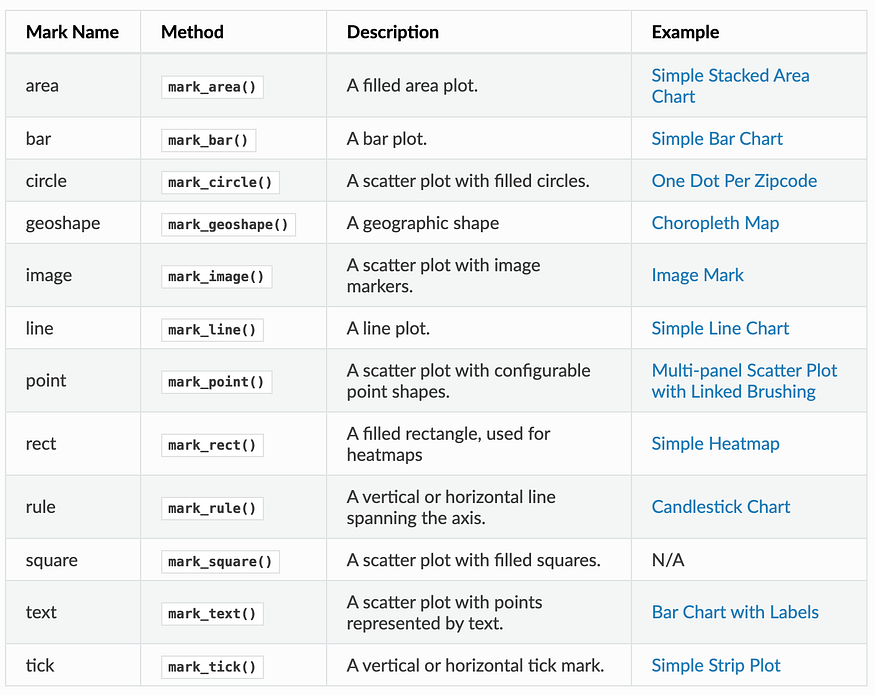
# Use the mark_point() method to display data
alt.Chart(data).mark_point()
The reason we got a single point display is that the rendering consists of one point per row in the dataset, all plotted on top of each other, since we have not yet specified positions for these points. And that will be resolved with Encodings.
In Altair, encodings is the mapping of data to visual properties such as axis, color of marker, shape of marker etc. The encoding method Chart.encode() defines various properties of chart display and it is the most important function to create meaningful visualization. The official user guide provides a long list of supported properties. The following are the most basic encoding properties and knowing them should be enough for you to create basic charts.
Position channels
* x: the x-axis value * y: the y-axis value * row: The row of a faceted plot * column: the column of a faceted plot
Mark Property channels
* color: the color of the mark * opacity: the opacity of the mark * shape: the shape of mark * size: the size of mark
Text channel
* text: text to use for mark
Data Types
* quantitative: shorthand code Q, a continuous real-valued quantity * ordinal: shorthand code O, a discrete ordered quantity * nominal: shorthand code N, a discrete ordered quantity * temporal: shorthand code T, a time or date value
# Add in encodings for x & y
ap =alt.Chart(data).mark_point().encode(
    x = 'col-1',
    y = 'col-2'
)
ap.properties(
    width=200,
    height=500
)
Making Charts Interactive
In addition to basic charts, one of the unique features of Altair is that users can interact with charts, including controls such as panning, zooming, and selecting a range of data.
Behind the theme, you can implement the pan and zoom by just calling the interactive() module. For example:
# Now make it interactive!
alt.Chart(data).mark_point().encode(
    x = 'col-1',
    y = 'col-2'
).interactive()
Making an Interactive Chart using Real World Data
Lets try to make an interactive chart using some of the sample data provided in the vega_datasets package. The cars dataset provides a lot of info about makes and models of cars, such as horsepower, weight, etc.
from vega_datasets import data
cars = data.cars()
cars.head()| Name | Miles_per_Gallon | Cylinders | Displacement | Horsepower | Weight_in_lbs | Acceleration | Year | Origin | |
|---|---|---|---|---|---|---|---|---|---|
| 0 | chevrolet chevelle malibu | 18.0 | 8 | 307.0 | 130.0 | 3504 | 12.0 | 1970-01-01 | USA |
| 1 | buick skylark 320 | 15.0 | 8 | 350.0 | 165.0 | 3693 | 11.5 | 1970-01-01 | USA |
| 2 | plymouth satellite | 18.0 | 8 | 318.0 | 150.0 | 3436 | 11.0 | 1970-01-01 | USA |
| 3 | amc rebel sst | 16.0 | 8 | 304.0 | 150.0 | 3433 | 12.0 | 1970-01-01 | USA |
| 4 | ford torino | 17.0 | 8 | 302.0 | 140.0 | 3449 | 10.5 | 1970-01-01 | USA |
First we’ll create an interval selection using the selection_interval() function:
# Create a brush variable that listens for selections on altair plots
brush = alt.selection_interval()
We can now bind this brush to our chart by setting the selection property:
# Create an altair scatter plot comparing Miles_per_Gallon (x) vs Horsepower (y) and color by Origin
# Also add the interactive selection brush created above
alt.Chart(cars).mark_point().encode(
    x = "Miles_per_Gallon:Q",
    y = "Horsepower:Q",
    color = "Origin:N"
).add_params(brush)
The result above is a chart that allows you to click and drag to create a selection region, and to move this region once the region is created. This is neat, but the selection doesn’t actually do anything yet.
To use this selection, we need to reference it in some way within the chart. Here, we will use the condition() function to create a conditional color encoding: we’ll tie the color to the “Origin” column for points in the selection, and set the color to “lightgray” for points outside the selection:
# Same as above, but change the color to be grey for those points not in the brush selection
# Create an altair scatter plot comparing Miles_per_Gallon (x) vs Horsepower (y) and color by Origin
# Also add the interactive selection brush created above
alt.Chart(cars).mark_point().encode(
    x = "Miles_per_Gallon:Q",
    y = "Horsepower:Q",
    color = alt.condition(brush, "Origin:N", alt.value("light grey")),
).add_params(brush)
Next, we create a mark_bar() chart
# Use altair to make a bar chart with the Origin country along the y-axis and counts on the x-axis. Color by Origin
alt.Chart(cars).mark_bar().encode(
    y = "Origin:N",
    color = "Origin:N",
    x = "count(Origin):Q")
In order to associate bar chart with the previous scatter chart, we need to use transform_filter() and pass the same brush. In addition, for composing multiple selection chart, we also need to create variable for each of them and use Composing Multiple selections & .
# points plot exactly the same as above
points = alt.Chart(cars).mark_point().encode(
    x = "Miles_per_Gallon:Q",
    y = "Horsepower:Q",
    color = alt.condition(brush, "Origin:N", alt.value("light grey")),
).add_params(brush)

# On the bar chart, add a transform_filter to listen to the brush
bars = alt.Chart(cars).mark_bar().encode(
    y = "Origin:N",
    color = "Origin:N",
    x = "count(Origin):Q").transform_filter(brush)

# Display points and bars
points & bars
Homework
Undergrads & Grads
Using the COVID-19 data from Lab 5, make a new DataFrame of the countries with the top 25 confirmed cases on the latest date (9/27/2021), and create a matplotlib bar chart plotting these top 25 countries vs confirmed cases on this date (Hint: Y-axis is Country/Region and X-axis is Confirmed)
import pandas as pd
import numpy as np
import matplotlib.pyplot as plt
from datetime import datetime
pd.set_option('display.max_columns', 50)
%matplotlib inline
confirmed_df = pd.read_csv('time_series_covid19_confirmed_global_long.csv')
latest = confirmed_df[confirmed_df['Date']=='9/27/2021']
#groupby country and sum
country_latest = latest.groupby('Country/Region')['Confirmed'].sum().reset_index()
top25 = country_latest.sort_values(by = 'Confirmed', ascending = False).head(25)
print(top25)
plt.figure(figsize = (10,8))
plt.barh(top25['Country/Region'], top25['Confirmed'], color='skyblue')
plt.xlabel('Confirmed Cases')
plt.ylabel('Country/Region')
plt.title('Top 25 Countries by Confirmed COVID-19 Cases (as of 9/27/2021)')
plt.gca().xaxis.set_major_formatter(plt.FuncFormatter(lambda x, _: f'{x/1e6:.0f}M'))
plt.show()
Country/Region Confirmed
181 US 43116442
79 India 33697581
23 Brazil 21366395
185 United Kingdom 7737941
144 Russia 7334843
62 France 7087110
180 Turkey 7066658
81 Iran 5547990
6 Argentina 5251940
37 Colombia 4952690
164 Spain 4951640
85 Italy 4662087
80 Indonesia 4209403
66 Germany 4209098
115 Mexico 3635807
140 Poland 2903655
162 South Africa 2897521
183 Ukraine 2503710
139 Philippines 2490858
108 Malaysia 2209194
138 Peru 2173354
125 Netherlands 2035980
82 Iraq 1996214
87 Japan 1696971
46 Czechia 1689620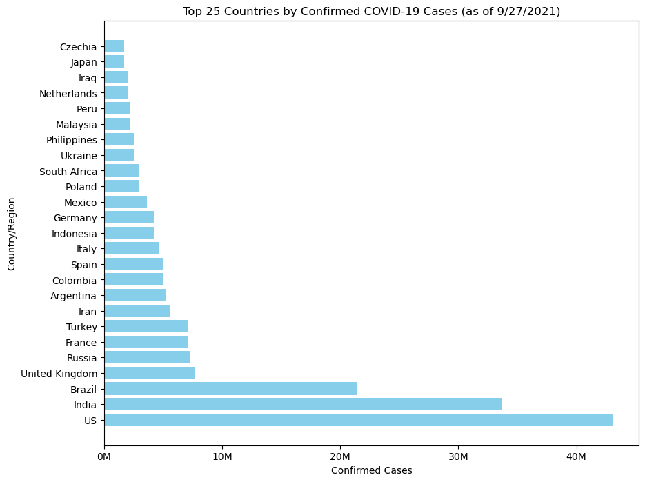
Make a line chart of US confirmed case count over time
import matplotlib.dates as mdates
us = confirmed_df[confirmed_df['Country/Region'] == 'US'].copy()
us['Date'] = pd.to_datetime(us['Date'])
us = us.sort_values('Date')
plt.figure(figsize=(10, 6))
plt.plot(us['Date'], us['Confirmed'], color='darkblue', linewidth=2)
# Labels and title
plt.title('Confirmed COVID-19 Cases in the United States Over Time')
plt.xlabel('Date')
plt.ylabel('Confirmed Cases')
plt.xticks(rotation=45)
plt.gca().yaxis.set_major_formatter(plt.FuncFormatter(lambda y, _: f'{y/1e6:.0f}M'))
plt.gca().xaxis.set_major_locator(mdates.MonthLocator(interval=1))   # tick every month
plt.gca().xaxis.set_major_formatter(mdates.DateFormatter('%Y-%m'))  # format as YYYY-MM
plt.xticks(rotation=45)
plt.show()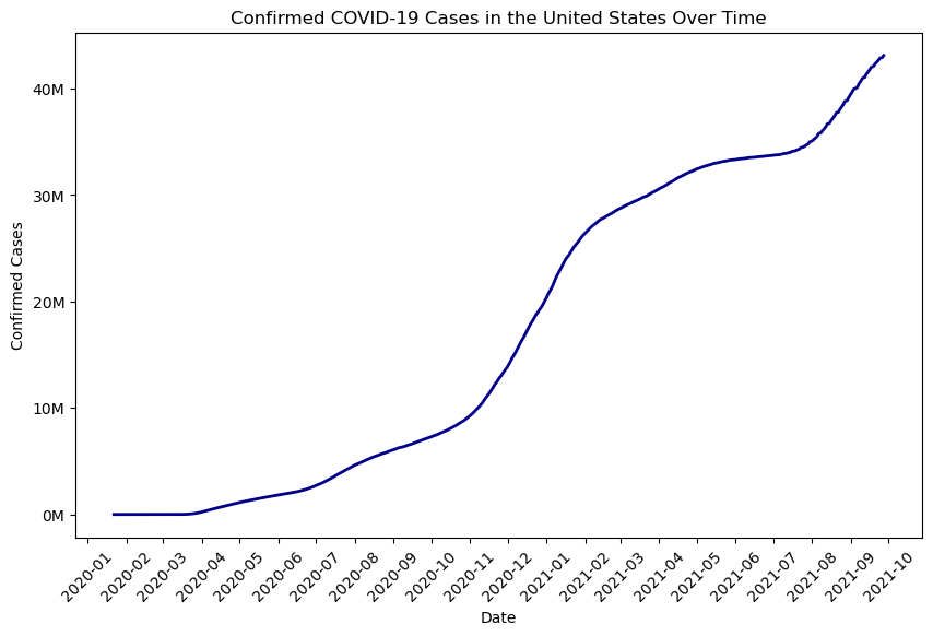
Load the Seattle weather dataset from the Vega sample datasets (seattle_weather). This dataset gives daily precipitation, min/max temperature, wind velocity and weather description for 2012-2015.
from vega_datasets import data
seattle = data.seattle_weather()
seattle.head()
seattle.info()
<class 'pandas.core.frame.DataFrame'>
RangeIndex: 1461 entries, 0 to 1460
Data columns (total 6 columns):
# Column Non-Null Count Dtype
--- ------ -------------- -----
0 date 1461 non-null datetime64[ns]
1 precipitation 1461 non-null float64
2 temp_max 1461 non-null float64
3 temp_min 1461 non-null float64
4 wind 1461 non-null float64
5 weather 1461 non-null object
dtypes: datetime64[ns](1), float64(4), object(1)
memory usage: 68.6+ KBCreate a pie chart using matplotlib, showing the percentage of days by weather type (sun, rain, snow, etc.)
import matplotlib.pyplot as plt
weather_counts = seattle['weather'].value_counts()
plt.figure(figsize=(8, 8))
plt.pie(
    weather_counts,
    labels=weather_counts.index,
    autopct='%1.1f%%',       # show percentages
    startangle=90,           # rotate to start at top
    colors=plt.cm.Paired.colors,  # use a nice color palette
    wedgeprops={'edgecolor': 'white'}
)

plt.title('Distribution of Weather Types in Seattle (2012–2015)')
plt.show()
Create a histogram of Seattle wind velocities using orange color bars and 25 bins.
plt.figure(figsize=(8, 6))
plt.hist(seattle['wind'], bins=25, color='orange', edgecolor='black')
plt.title('Distribution of Daily Wind Velocities in Seattle (2012–2015)')
plt.xlabel('Wind Velocity (m/s)')
plt.ylabel('Frequency')
plt.show()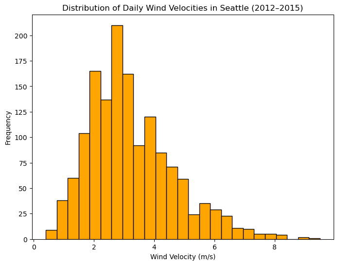
Just Grads
Using altair and the Seattle weather data, make an interactive chart of daily minimum temperatures for the month of January 2012. When the user selects on the chart, make it show the average minimum temperature as a horizontal red reference line just for the selected dates. (Hint: check out this example: https://altair-viz.github.io/gallery/selection_layer_bar_month.html)
import altair as alt
from vega_datasets import data
import pandas as pd
seattle = data.seattle_weather()
seattle['date'] = pd.to_datetime(seattle['date'])
# Filter for January 2012
jan2012 = seattle[(seattle['date'].dt.year == 2012) & (seattle['date'].dt.month == 1)]
brush = alt.selection_interval(encodings=['x'])
bars = alt.Chart(jan2012).mark_bar(color='steelblue').encode(
    x=alt.X('date:T', title='Date'),
    y=alt.Y('temp_min:Q', title='Minimum Temperature'),
    tooltip=['date:T', 'temp_min:Q']
).add_params(brush)
mean_line = alt.Chart(jan2012).transform_filter(
    brush
).transform_aggregate(
    mean_temp='mean(temp_min)'  # Calculate mean of filtered data
).mark_rule(color='red', strokeWidth=2).encode(
    y='mean_temp:Q')


chart = bars + mean_line
chart.properties(
    title='Daily Minimum Temperatures (January 2012)',
    width=600,
    height=300
)
Using the COVID-19 data from Lab 5 and altair, create a bar chart showing the countries (including states/provinces is fine) with the top 25 most confirmed cases on the most recent date. Also create a line chart showing total deaths over time, and make it interactive so if the user selects a country in the bar chart, it updates the line chart to only show the deaths over time for that country.
import pandas as pd
import altair as alt

confirmed_df = pd.read_csv('time_series_covid19_confirmed_global_long.csv')
deaths_df = pd.read_csv('time_series_covid19_deaths_global_long.csv')
confirmed_df['Date'] = pd.to_datetime(confirmed_df['Date'])
deaths_df['Date'] = pd.to_datetime(deaths_df['Date'])
confirmed_df['Country/Region'] = confirmed_df['Country/Region'].str.strip()
deaths_df['Country/Region'] = deaths_df['Country/Region'].str.strip()

latest_date = confirmed_df['Date'].max()

#top 25 confirmed cases
latest_confirmed = confirmed_df[confirmed_df['Date'].dt.date == latest_date.date()]
top25 = (latest_confirmed.groupby('Country/Region')['Confirmed']
         .sum()
         .reset_index()
         .sort_values('Confirmed', ascending=False)
         .head(25))

country_selection = alt.selection_point(fields=['Country/Region'], empty='all', name='CountrySelector')


bars = alt.Chart(top25).mark_bar().encode(
    x=alt.X('Confirmed:Q', title='Confirmed Cases'),
    y=alt.Y('Country/Region:N', sort=alt.EncodingSortField(field='Confirmed', order='descending'), title='Country/Region'),
    color=alt.condition(country_selection, alt.value('#FF6347'), alt.value('lightgray')),
    tooltip=['Country/Region', 'Confirmed']
).add_params(country_selection
).properties(
    width=600,
    height=400,
    title=f"Top 25 Countries by Confirmed COVID-19 Cases ({latest_date.date()})"
)

#deaths
deaths_long = deaths_df.groupby(['Date', 'Country/Region'])['Deaths'].sum().reset_index()
deaths_long_top25 = deaths_long[deaths_long['Country/Region'].isin(top25['Country/Region'])]


line = alt.Chart(deaths_long_top25).mark_line(point=True).encode(
    x=alt.X('Date:T', title='Date'),
    y=alt.Y('Deaths:Q', title='Total Deaths'),
    color=alt.Color('Country/Region:N', title='Country'),
    tooltip=['Country/Region', alt.Tooltip('Date:T', format='%Y-%m-%d'), 'Deaths:Q']
).transform_filter(country_selection
).properties(
    width=600,
    height=400,
    title='Total COVID-19 Deaths Over Time (Filtered by Selection)'
)


display(alt.vconcat(bars, line).resolve_scale(color='independent'))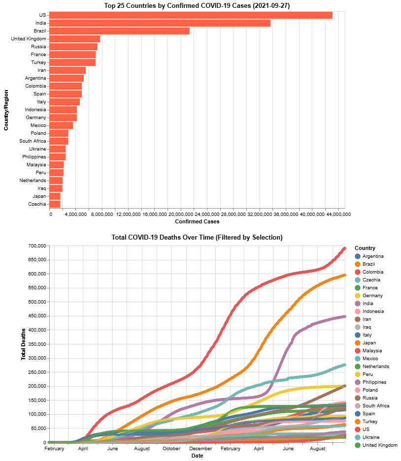
# pip install altair
# alt.data_transformers.enable("vegafusion")
# !pip install vegafusion vegafusion-jupyter altair

# Use ! to run pip install commands in Jupyter notebooks
!pip install altair
# alt.data_transformers.enable("vegafusion") - This line should be run after importing altair
!pip install vegafusion vegafusion-jupyter altair
!pip install "vegafusion[embed]>=1.5.0"
^C
Requirement already satisfied: altair in c:\users\ashle\anaconda3\lib\site-packages (5.5.0)
Requirement already satisfied: jinja2 in c:\users\ashle\anaconda3\lib\site-packages (from altair) (3.1.3)
Requirement already satisfied: jsonschema>=3.0 in c:\users\ashle\anaconda3\lib\site-packages (from altair) (4.19.2)
Requirement already satisfied: narwhals>=1.14.2 in c:\users\ashle\anaconda3\lib\site-packages (from altair) (2.7.0)
Requirement already satisfied: packaging in c:\users\ashle\anaconda3\lib\site-packages (from altair) (23.1)
Requirement already satisfied: typing-extensions>=4.10.0 in c:\users\ashle\anaconda3\lib\site-packages (from altair) (4.12.2)
Requirement already satisfied: attrs>=22.2.0 in c:\users\ashle\anaconda3\lib\site-packages (from jsonschema>=3.0->altair) (23.1.0)
Requirement already satisfied: jsonschema-specifications>=2023.03.6 in c:\users\ashle\anaconda3\lib\site-packages (from jsonschema>=3.0->altair) (2023.7.1)
Requirement already satisfied: referencing>=0.28.4 in c:\users\ashle\anaconda3\lib\site-packages (from jsonschema>=3.0->altair) (0.30.2)
Requirement already satisfied: rpds-py>=0.7.1 in c:\users\ashle\anaconda3\lib\site-packages (from jsonschema>=3.0->altair) (0.10.6)
Requirement already satisfied: MarkupSafe>=2.0 in c:\users\ashle\anaconda3\lib\site-packages (from jinja2->altair) (2.1.3)